Saturday, 28 February 2015

27.02.2015 CONSTRUCTION: EDITING POSTER & WEBSITE PHOTOS


I created this photo collage using Photovisi, an online website that allows you to make photo collages or edit photos and upload them onto social media websites such as Twitter and Facebook. 

Agatha and I started editing photos for the poster and website of our film opening, The Unhinging. We started adjusting the light and darkness of a photo taken of Demi, playing our main character India, as well as adjusting the colour of the trees behind her. For example we added a red layer of colour over the top of the trees creating a red sunset effect behind the branches making it appear there is a threat, danger (or blood) to India's safety. We made her eye brighter as well, making the colour of her eyes an amber colour. We thought this was fitting as we used the Amber Alert messages/true story of the kidnapping of Amber Hagerman as inspiration for our film opening. We also thought that as Demi has a red hair the background and eye colour would match well with the character and appearance of India - the colour red is associated with danger. 

I had the idea to use a profile shot of Demi looking to the left, mirrored to the right. For example, as seen in the top photo on my Photovisi collage, we reflected the image to the right hand side creating a mirroring effect. We were careful to make it symmetrical, adding darker shading around her hair line to blend both profiles together. I thought this looked great and an image we could use, as well as the image we edited prior to this (described above) on our poster as it would create a sense of India being lost, enigma; adding to the mystery of the kidapping. We added the title of our film opening to see how it looked.We now understand that our title needs to be edgy, mysterious and have an effect connected to the 'kidnapping' theme for example using font that appears to look like the bark of a tree or writing that someone has etched using a sharp object. This makes the film appear that it has a criminal theme - kidnapping. 

Thursday, 26 February 2015

26.02.2015 CONSTRUCTION: BASEMENT AND JACKS HOUSE SCENES


Using Photosnack, I have made a slideshow of the photos I took whilst filming scenes in the basement and house owned by India's kidnapper, Jack. Photosnack is a free, online website that allows you to make slideshows of photos and gives you the option to upload them directly onto social media websites such as Facebook and Twitter or gives you an embed code to upload onto Blogger, like I did.

Demi, Agatha, Sophie and I filmed the scenes in the basement and house owned by India's kidnapper, Jack. We also filmed the final scenes of Jack including him smashing the mirror, him using a piece of smashed mirror (as seen in photo 2) and 'cutting' India's face as well as when he exits the house. We decided to add suspense creating an eerie atmosphere, instead of Jack exiting the house shutting the door behind him, we decided that the door should slowly shut behind Jack with a creak, slowly visually disguising his face (as seen in the first video below and photo 5). This adds a sense of mystery to the shot.

As we had finished shooting all scenes in the woods and the majority of scenes in 'Jacks' house, we crossed all the scenes off the shot list making it easier for us to understand what we have left to do, redo and edit.


Friday, 13 February 2015

13.02.2015 CONSTRUCTION: CONTINUED FORREST SCENES


Using PhotoSnack, I have made a slide show of the photos I took from our continued forrest shoot. PhotoSnack is a free slideshow maker software online.

Demi, Agatha, Sophie and I decided that we should start taking photos for the poster of our film opening, The Unhinging

The 3rd and 4th photos of the photo slide show I made, are examples of inspiration we took for our movie poster including shots of India behind trees with her face peeping out behind the trunk, India looking directly at the camera lens through the branches of a tree (with the green leaves being exposed to the camera creating a blurry effect in the edges of the shot) and India running directly towards the camera through a clearing of leaves in the forrest. 

We all agreed that we want to create a poster for our film, much like the posters of these films (some of these aren't of the same genre as our film, but their posters have the same layout we intend to create): 


I made this photo collage using piZap, an online photo editor and collage maker (please click to view).

This is a rough example - I have drawn this
Eye view movement - I have drawn this
I want to create a sense of 'level' in the photo, not in the sense of hierarchy and status but as if the chase sequence of Jack, India's kidnapping, is searching for her. For example, Jack may be running on the bottom right hand side of the poster with India running on the top left hand side of the poster. Also in the middle of the poster their could be a faint, outline of India's face behind the title of the film, creating a sense of mystery and suspense. 

I have acknowledged that the poster of our film opening should be appealing, eye catching and interesting to audiences, therefore attracting them to watch the film. I have acknowledged that the eye views objects, from 'right to left' in a zig-zag (shown above).  Therefore I feel that the main character, India, should be the first person the audience see. 

Thursday, 12 February 2015

12.02.15 CONSTRUCTION: FORREST SCENES


I used Photovisi to make a photo collage of the photos I took prior to filming (when make up was being applied on Demi, playing India) and whilst filming was taking place. Photovisi is a free, online photo collage maker and editing software online.

In class, Demi, Agatha, Sophie and I filmed the scenes when India (our main character) is running through the forrest, unaware that her kidnapper, Jack, is following closely behind her. We filmed shots of India running up to locked gates, struggling to unlock locks, frantically running down long, winding clearings in the forrest and quickly pushing past branches and sharp leaved bushes - as seen in the videos I recorded on my phone below.


Tuesday, 10 February 2015

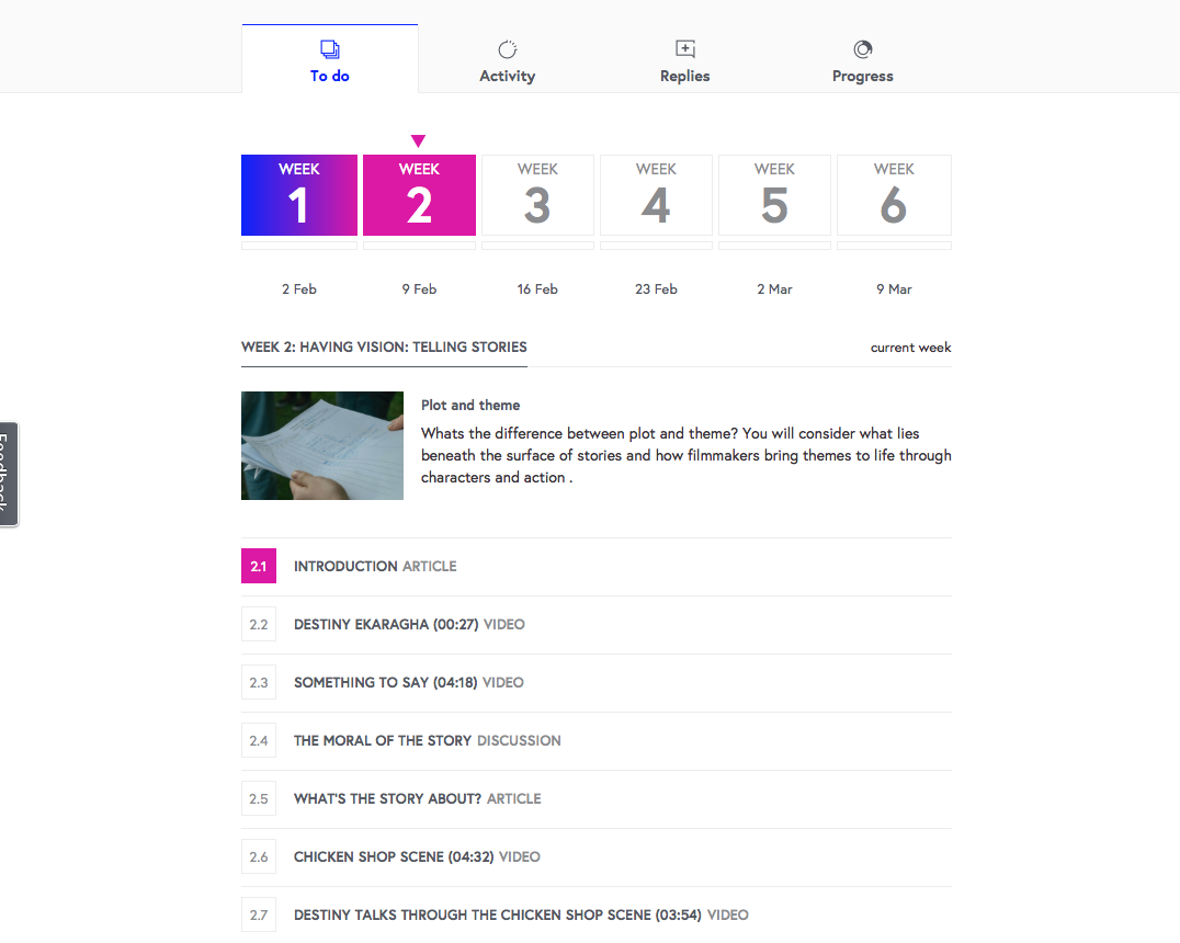
10.02.2015 FUTURE LEARN FILM MAKING FROM SCRIPT TO SCREEN ONLINE COURSE


I have just signed up to a free online 6 week course on Future Learn focussing on the process of film making; how films get from script to screen with the help from award winning film makers from the NFTS and BFI Film Academy. This course will allow me to have a better understanding of how films get from script to screen. 

Throughout the 6 week course I will be looking at recent articles, videos of recent film makers describing the stages of making scenes of chosen, recent films as well as taking part in discussions on planning a scene, for example. 

I will be completing 3 hours per week for 6 weeks - receiving a certificate completing the course. 

I have tweeted about signing up to this 6 week film course on my twitter page - as seen on the right hand side twitter feed (scroll down to find tweet).


Friday, 6 February 2015

06.02.2015 PLANNING: LOCATION RECCE

A result of not being able to use the cameras from Media Studies, we completed a location recce in the woods at Claremont instead. In order to be organised for future filming, Demi, Sophie and I decided that we should go and check our location for any changes or possible problems we may encounter; also this allows us more time to edit the shots in the studio.

We found an abandoned 'gardeners' shed in the woods, that was dilapidated, full of leaves, debris and had damp areas such as below the open, roofed section. Although this location, the abandoned shed, wasn't planned to be used in our film opening, I felt we could use a few second shots of this location when our main character, India, is lost in the woods looking for shelter whilst hiding from our main antagonist, Jack. Due to the open, roofed section of the shed that allows sunlight to flow in creating a highlighting, beam effect, of India for example if she stands underneath it, showcases her bruises, cuts and torn clothing, highlighting how vulnerable she is.

I made a photo collage in BeFunky, a free photo collage and editing software online.


06.02.2015 FILMING: MAKE UP

Demi, Sophie and I intended on filming the woodland scene in media, however we realised that we were unable to use the cameras in Media Studies. Prior to realising, this we decided to put the correct make up on India, our main character, using dark coloured, earthy, eyeshadows such as a palate of kohl, green and grey eyeshadows, blending out the edges of the layers of colours creating bruising. As shown in the video below. 


We did this around the mouth, top of the cheek bone and side of the forehead, making it appear that India's bruising was recently made therefore showing that she regularly physically abused by her kidnapper, Jack.

We decided that adding fake blood would make the make up look gory, fresh and suited to India's background of being abused. Also adding such a bright colour, red, would make the bruising on her face stand out to the camera compared to the dark, shading of eyeshadow around the mouth and upper sections of the face.

I made this photo collage of the photos I took whilst India was being made up, on PicMonkey, a free photo editing and collage creating software online.