
Monday 27 October 2014
Thursday 16 October 2014
16.10.2014 RESEARCH: LES BLEUS DE RAMVILLE & SUITS
In class we watched the title sequence of Les Bleus de Ramville, a Canadian film set in the fictional location of Ramville close to North Bay, Ontario in Canada. The television series that premièred on TFO in January 2012, focuses on 4 members of a local senior ice hockey team's fan club. The ice hockey team is called the Radiateurs Dufresne.
Using the website - http://vimeo.com/35372404

 Visual Effects known as, VFX, have been used in this slow motion close up shot. By using VFX, it makes the bold colours, blue, red and pale orange, appear to move and become animated filling the Les Blues de Ramville motif. In my film opening, I could potentially do this with the title by using software such as, iStopmotion.
In class we also looked at the opening title sequence of American television series, Suits.
Using the website - https://www.youtube.com/watch?v=WRtDFiTNLaY


This shot is a fast paced tracking shot of a United States of America flag. With a statue of presumably a previous president on the right, this creates a patriotic, proud feel. Placing key props (mis-en-scene) on the right/left of the frame gives me space to place an actors name or another prop on the opposite side, giving the audience a clear focus of each object on a dark or light background (depending on the colour of the object). This is something I intend on doing in my film opening.

The background music is very pacing and repetitive - using percussion instruments such as guitar and bass with a strong drum beat in the background. This creates a grating effect of constant hard work, daily routine and a fast paced lifestyle of hectic, busy commuting in the city. This is something I intend on doing in my film opening, music will play a large role as it creates emotion and atmosphere.
Using the website - http://vimeo.com/35372404
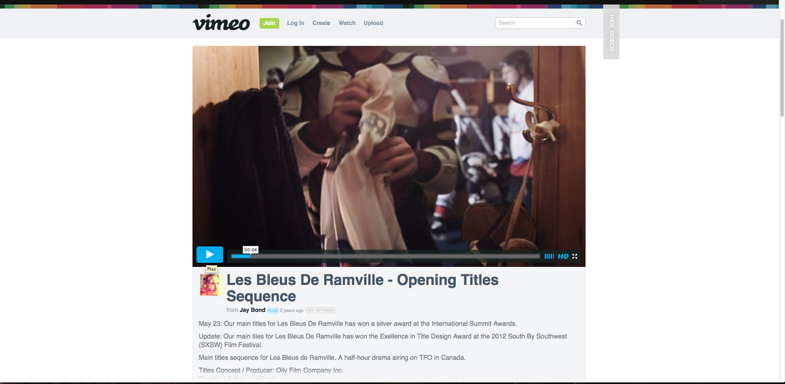 | ||
| This is a close up mid shot. In this shot, the player is reaching into his
locker to pick up his ice hockey jersey. The close up frame forces the audience to pay attention to the preparation before the impending ice hockey match. This contributes to a tense atmosphere. For my film opening, using close up mid shots will attract the audiences attention. This is a shot that I will aim to use in my opening. |
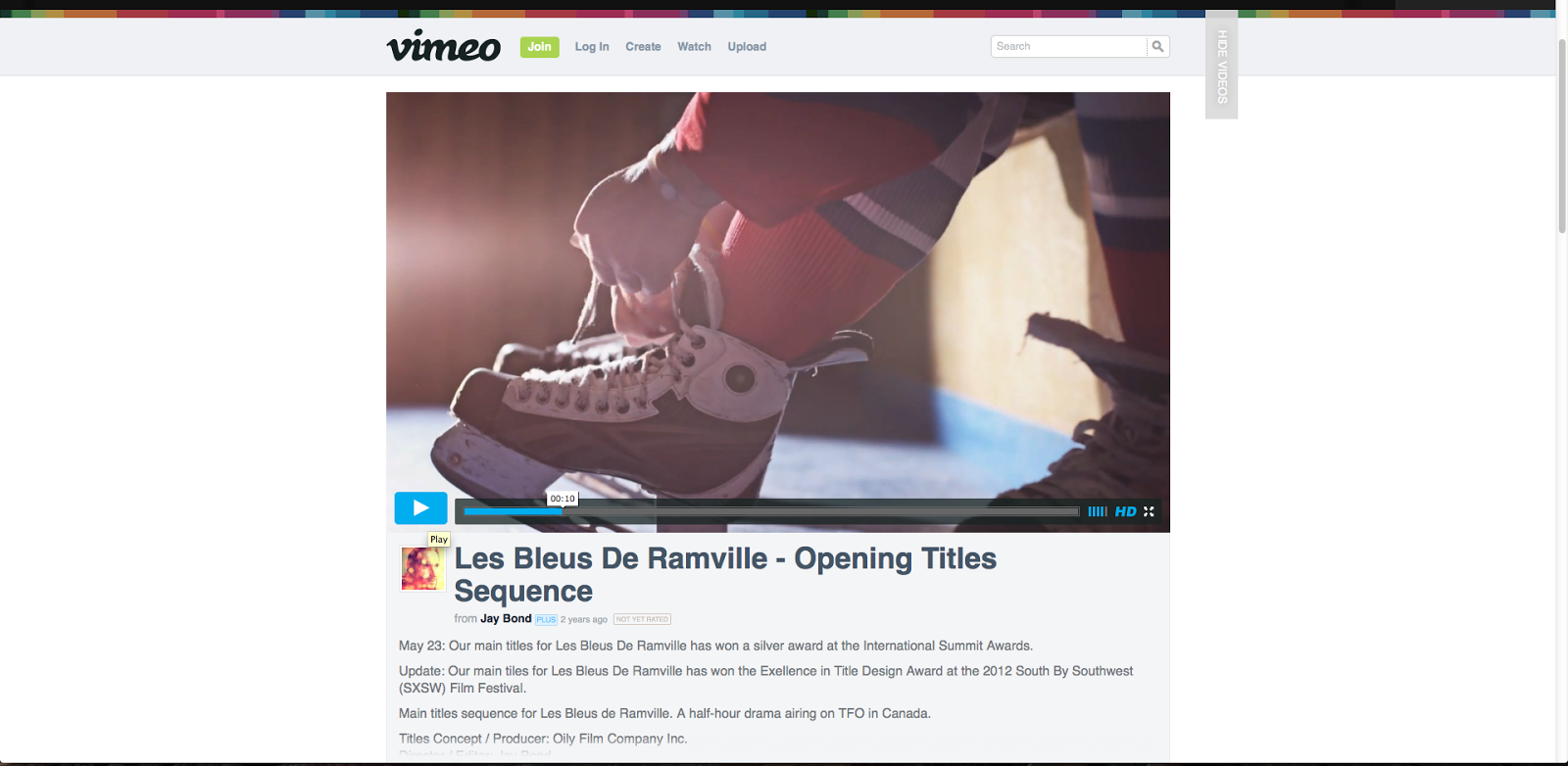 |
| This is a low angle, close up shot showing an ice hockey player tying his skate laces. The shot conveys the process of preparing for a match such as getting dressed into appropriate attire such as long thick socks to wear under heavy, sharp ice hockey skates, fingerless gloves for protection and grip of the stick, with a thick material jersey for warmth and identity (what team you are on). It conveys the steady build up of adrenaline, getting pumped for the impending game, this shows the audience how hockey player prepare for a match. Using different props in my film opening (mis-en-scene) will make my film opening unique and suited to the genre I have chosen. |
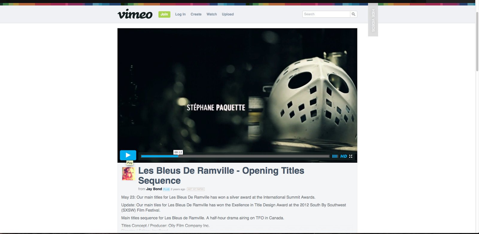 | |||
| This is a slow paced tracking shot of a face mask to be worn under an ice hockey helmet. The mask appears to look barbaric as there are squared holes in the mouth area and forehead, with squares for you to breath and holes to see through. Placing the mask on the right hand side gives you space to place the actors name on the left. It is written in white and placed on a black background, making it easier to read and bold. I intend on doing this in my film opening as it makes the actors names recognisable and easy to read. |
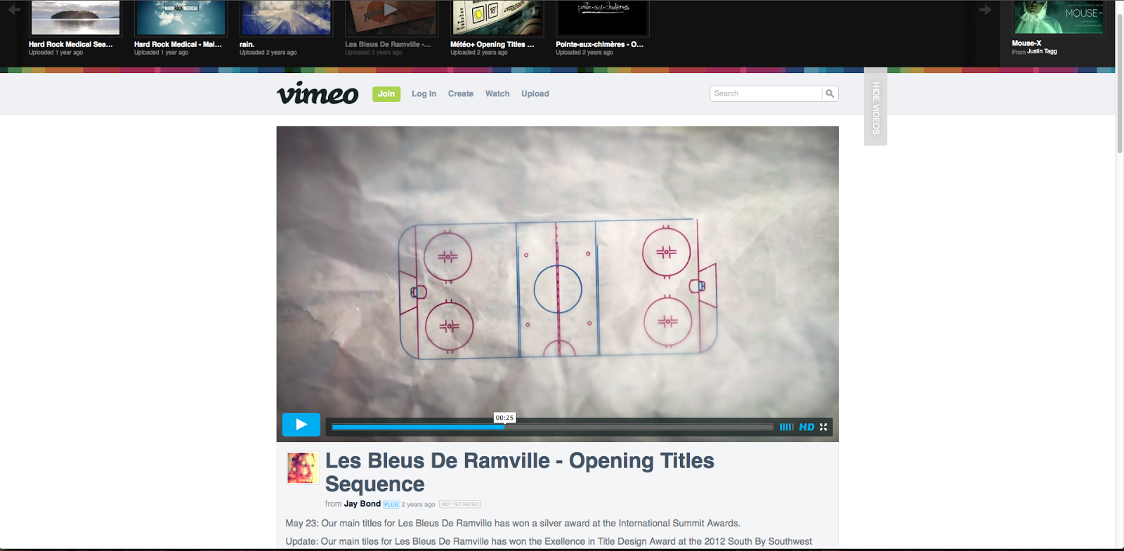 |
This is a slow motion close up shot of sketch of the ice hockey rink. It is made in a piece of Software such as iStopmotion which I have also practised - I could use this when I do my film opening. This creates suspense as it shows impending tactics against the opposition with use of noughts and crosses. It shows the ruggedness, fact paced action of the game written on a creased, damaged piece of paper.
|
The background music is very pacing and repetitive
- mainly use of piano with a soft percussion and drumming beat in the
background creating a grating effect of constant hard working from the team
members of the ice hockey team. This creates suspense and thrill as the music is getting faster in pace especially when a point is scored, shown in the picture above. Using music that will captivate and entice the audiences attention will be an extremely important factor in my film opening.
In class we also looked at the opening title sequence of American television series, Suits.
Using the website - https://www.youtube.com/watch?v=WRtDFiTNLaY
The opening shot of the title sequence shows the hustle, business and constant pace of daily New York living. This includes constant traffic on crowded New York blocks as well as tall, high rise buildings caving in on the streets. Using software like iStopmotion (that I intend on using), they have created a checker board style motion on the screen creating the busy, crowded, visually crowded atmosphere with constant movement.
The background music is very pacing and repetitive - using percussion instruments such as guitar and bass with a strong drum beat in the background. This creates a grating effect of constant hard work, daily routine and a fast paced lifestyle of hectic, busy commuting in the city. This is something I intend on doing in my film opening, music will play a large role as it creates emotion and atmosphere.
Monday 6 October 2014
06.10.2014 RESEARCH: THE ART OF THE TITLE #3
In today's lesson, I looked at the website Art Of The Title: http://www.artofthetitle.com as inspiration for my own film opening sequence.

Spring Breakers (wri.Zack Kotzer, 2013) - http://www.artofthetitle.com/title/spring-breakers/
For my third piece of close analysis, I used my own observations, class discussion and The Art of the Title website.


Spring Breakers (wri.Zack Kotzer, 2013) - http://www.artofthetitle.com/title/spring-breakers/
For my third piece of close analysis, I used my own observations, class discussion and The Art of the Title website.
- The genre of this film is crime fiction drama. The title sequence is fun loving, vibrant with use of neon colours commonly worn/or associated with teens or young adults and up-beat. The title sequence attracts the audience attention through: use of vibrant neon colours such as acidic yellow, pinks and oranges (all of which are flashing brightly when projecting the title Spring Breakers or actors names). Each cast/crew members name is projected with a symbolic firework shaped Capital letter - shaped as a tropical animal associated with Spring Break in America (a week's holiday for students in the spring, typically at Easter aimed at University or College students - students typically go to Mexico or Cabo). For example the 'V' in Vanessa is in the shape of a V firework. This accentuates the 'young', 'hip' feeling of the film.
- The period is clearly established by the use of bright colours on a black background, 20th Century Pop music by Ellie Goulding Lights and upbeat tempo with loud drumming beat as a constant reminder of the fun loving holiday, Spring Break.
- Colour and lighting are main visual codes. The vibrant, electric, hyperactive lighting and the colour black showcases the neon colours - reminding audiences that it is a young, teen film.

Storyboard of sequence - There is no camera movement as the graphics and cast/crew names are centre focus on the screen creating an energetic, exuberant and hyperactive atmosphere.

Saturday 4 October 2014
04.10.2014 RESEARCH: THE ART OF THE TITLE #2
In today's lesson, I looked at the website Art Of The Title: http://www.artofthetitle.com as inspiration for my own film opening sequence.

Detectives (wri. Noah R Taylor, 2013) - http://www.artofthetitle.com/title/detectives/
 |
| Original Storyboard/ First Design |
For my second piece of close analysis, I used my own observations, class discussion andThe Art of the Title website.
- The genre of this film is spy/detective thriller mystery hybrid. The title sequence is fast paced, fun, mysterious and energetic being set in Paris, France. This invites the viewer to pay attention to each visual clue: each member of the cast/crew has their name typed in white lettering in the bottom middle of the screen (as the camera is tracking and in motion shot, the road is where the cast/crews names are). The hectic yet decisive and fast paced planning of the investigation attracts the audiences attention, for example matching number plates of cars (the first car is a Peugeot, a French brand) to suspects as well as tracking where they live and the 'hotspots' they commonly visit on a regular basis. With help of technology such as Google Mapping and Satellite Navigation (with clues such as a mouse on the screen), creates an atmosphere rich in intelligence and superiority; for example detectives are using the highest quality technology with powerful software only available to secret services such as the FBI or French Police.
- The period is established by the use of modern day/20th Century mis-en-scene: modern day cars such as Audis and Peugeots, modern day double yellow lines on streets, up to date detective technology being projected on the screen, modern day lights such as lighting up the Eiffel Tower and street lamps.

- Colour and lighting are important visual codes. The bright, realistic light creates a warm, safe feel showcasing the white, black balcony buildings of Parisian Avenues.

- The camera movement is part of the method: the camera pans and zooms over the series of houses, cars zooming in on number plates, tracking moving cars and vans, front doors, Eiffel Tower, view from Sacre Coeur and a tracking shot of the foot path by the River Sen.
- The music is suitable for the spy/detective thriller mystery hybrid as it is fast paced, Parisian themed with phrases such as 'I made it to the city of lights (nickname for Paris)'. The musical instruments played include the bass guitar creating a 'trekking', 'constant movement and pacing' feel with a drumming, percussion beat in the background.


Friday 3 October 2014
03.10.2014 RESEARCH: THE ART OF THE TITLE #1
In today's lesson, I looked at the website Art Of The Title: http://www.artofthetitle.com as inspiration for my own film opening sequence.

Great Expectations (dir. Nic Benns BBC, 2011) - http://www.artofthetitle.com/title/great-expectations/

For my first piece of close analysis, I used my own observations, class discussion and The Art of the Title website.
Great Expectations (dir. Nic Benns BBC, 2011) - http://www.artofthetitle.com/title/great-expectations/
 |
| The Progression of Concept |
 |
| Victorian butterfly pinning |
For my first piece of close analysis, I used my own observations, class discussion and The Art of the Title website.
- The genre of this film is costume drama. The title sequence has a mysterious, eerie, antiquated feel with use of Victorian lace and white butterflies coming alive, possibly symbolising the growing of Pip, the main character. The butterflies are reminiscent of the Victorian framing of pinned adult butterfly specimens, this was very fashionable at that time.
- Each member of the crew/cast has their name appear next to the dominant image of a white, delicate transparent butterfly that continues to grow and come alive as the sequence progresses. Each name disappears differently for example: as the brightness of the clip increases the names fade out in white matching the lace background, names flash off the screen when the butterfly flutters its wings almost flicking the names off the screen or names 'blot away', making it appear someone is writing in calligraphy (commonly used in the Victorian era) and keeps on spilling ink having to blot it up with a tissue.
- The historical period is visibly established by the period quality of the props used in the opening: the butterfly, the Victorian style lace, the cream/white thick paper style background with calligraphy style writing and ink splatters.


- Colour and lighting are important visual codes. The sepia tone lends a period air and the colour black predominates, showcasing the use of white, clear, vibrantly highlighted objects. It feels dated with use of colours such as creams, oranges and blacks - the cream colours used as the background and butterfly colours appear to look sun-bleached, having once been white with the sun dying them. This invites the viewer to take pleasure in the way that each scene of the opening can be interpreted differently.
- The camera movement makes the opening of this television series interesting and captivating to view: the camera pans in a slow glide over the vintage, white objects/textures. It stops over each credit (name) to allow the viewer view the cast/crew members name as well as to whiteness the vivid objects. The music is a single piano playing a soft yet high pitched/loud tune with a constant, dominating beat; at times signalling a new name of cast/crew member appearing on the screen or the butterfly growing. At the end of the opening sequence, there is a vibrant, high pitched violin note, signalling the programme is about to start.

Subscribe to:
Posts (Atom)